Monday, November 28, 2011

"To understand is to stand under which is to look up to, which is a good way to understand."- Sister Corita


"Corita Kent's...work was a living meditation, with consciousness and devotion to the soul of the here and now"-Lorraine Wild.

Sister Mary Corita/Sister Corita Kent, was born Frances Elizabeth Kent in 1918, but changed her name when she joined the Order of the Immaculate Heart of Mary in 1936. She is known in the design world as a legendary for her bright, progressive silkscreen prints.

It's unmistakable that she was an artist in the 1960s. Her work is clearly reflective of the time she lived in; full of change, hope, and social activism. It is also said she was partly inspired by Pope John XXIII's challenge for the Catholic Church to renew and rethink it's traditions. Corita's work combined colour, type, and image to create bold, beautiful pieces of art sending out a message of love, faith and joy.


Sunday, November 20, 2011

Pizza considered a vegetable? Way to go America...


This article infuriates me. America is ranked #1 in the world for obesity, and after reading this article it's no surprise as to why. 

According to a decision made by Congress anything containing 2 tablespoons of tomato paste can now be considered a vegetable. This means that a slice of pizza now falls into the vegetable column. The article also makes it clear that this is purely a political move to stop some major industries from taking a severe cut in revenue. 


There are many different opinions on this recent decision. I picked out two contrasting views:

Retired Air Force General Richard E. Hawley, (who now works with Mission: Readiness to combat obesity):
“This is a tragedy for the country... We are taking a step backward apparently in response to pressure from groups who see it in their interest to serve junk food in our schools.”

Corey Henry (spokesman for the American Frozen Food Institute):
“We are not saying pizza is a vegetable... What we are saying is if you serve a slice of pizza with 2 tablespoons of vegetable paste, it can be an important way to deliver a number of vegetables that children will actually consume.”

Now to some of my issues with this decision... 

1) Aren't tomatoes considered a fruit? So why the hell Congress just allowed them to be considered a serving of vegetables is beyond me. 

2) Even if tomatoes were a vegetable the amount of sugar in the tomato paste, fat in the cheese, and carbohydrates in the crust should be enough to have it banned school menus altogether. 

3) Budget cuts in this area is going to severely affect the American economy in the long run. To highlight how obesity effects the economy I have listed a number of staggering statistics:
  • $127million are spent on hospital costs each year due to childhood obesity. This is more than 3 times that of 2 decades ago. 
  • Annual direct costs of childhood obesity= $14.3 billion.
  • In 1994 US businesses spent $5 BILLION in non-medical costs due to obesity:
    • $2.4 billion was spent on paid sick leave
    • $1.8 billion on life insurance
    • $0.8 billion on disability insurance 
  • US-wide annual cost of “excess” medical speding attributed to obesity=$86-$147 billion.

Economy aside, it's astounding to me that Congress doesn't seem to be at all concerned with how this decision will effect overall health in America. In fact, it may even increase the amount of obese people in the country. In short, studies show that obese children are more likely to grow up to be obese adults. Obese adults are more likely to raise obese children, as the children adopt the eating/exercise routines of their parents. 


End rant. 

Article link:
http://www.thejournal.ie/us-congress-rules-that-pizza-is-a-vegetable-282033-Nov2011/

Link to a report on the issue by MSNBC:
http://www.youtube.com/watch?v=PJy971DCDlg

Friday, November 18, 2011

"Bring joy and vigor to whatever you do."- Ray Eames


Charles and Ray Eames are considered icons in the design world. They explored many facets of design including: architecture, engineering, drawing, textiles, furniture, fine art, photography, film, and industrial and graphic design.

They were both successful artists and designers before they married in 1941, however, as a team the dynamic duo took the design world by storm. One thing that caught my attention in particular was the house they built for Arts and Architectures experimental housing project in the 1940s. With the end of WWII, millions of soldiers returned to the US causing an incredible strain on the housing in America. So to help, the magazine hired numerous notable architects of the time to design and construct modern inexpensive houses in order to cope with the increased demand.

Ray and Charles Eames were amongst the commissioned architects and ended up building Case House #8, also known now as the Eames House. They built this house on the Pacific Coast in California. Originally the house was designed to stretch into and across a meadow on the property. But after seeing the gorgeous landscape, the couple decided to build the house at the very edge of the property to preserve as much nature as possible.

The structure of the house is a pattern of repeating a cube. They then split the house into two functional parts, living area and studio. The interior is open, comfortable, and inspired by the Japanese way of living. This house is still considered a marvel in modern architecture and the most successful in the Case Housing Study. Below is a link to a video made by the couple of their house.


Article link:
http://www.stepinsidedesign.com/STEPMagazine/Article/28824/

Video link:
http://www.youtube.com/watch?v=hv7ipQdUrYk&feature=related

Monday, November 14, 2011

Help save the polar bear!!!

Just came across this and had to post! Polar bears are one of my favorite animals, who seem to be on the brink of extinction. WWF and Coca-Cola have come together to make an effort save these gorgeous creatures.


To raise awareness for this cause and their efforts, Coca-Cola is turning their traditional red cans white for the first time in history!


I donated $10. I know it's not a lot, but hopefully it will help. Even if you don't care to donate, I highly recommend taking a look at their website and it's amazing interactive features like: tracking a polar bear, selecting an area to save, videos, and real time climate information from the Arctic. Also, their web design is amazing!


Here is some of the key information from their site:

THE POLAR BEAR'S GREATEST THREAT
The polar bear spends its life on the Arctic sea ice where it hunts, lives and breeds. Unfortunately, the sea ice is melting at an unprecedented rate, and the loss of habitat is now the polar bear's greatest threat... At the current rate of melting, experts predict that there will be no ice in Hudson Bay by 2080 and—if current warming trends continue—some populations of polar bears could be lost within the next century.

CREATING A REFUGE
Together with World Wildlife Fund, The Coca-Cola Company has developed the Arctic Home project to ensure the polar bear has a place to call home in the future. This project is helping to further WWF's global vision to protect the Arctic, which includes working with local Indigenous communities, supporting cutting-edge research, and carrying out additional conservation work with partners. Today, WWF is working with Arctic residents to develop a plan for the future of ice-dependent animals including the polar bear—a plan built around a natural "safety net" of ice high in the Arctic archipelago of Canada and Greenland that will likely persist longer than anywhere else in the world.

This ice area could cover about 500,000 square miles and is twice the size of the state of Texas. While it is little understood at present, WWF is working to better understand the dynamics of the area, how animals and people currently use it, and how it may be used in the future.


FUNDING THE PROJECT
This project will cost an estimated $10 million during the next five years and will depend on donations from efforts like Arctic Home to successfully provide a refuge for the polar bear while accommodating the needs of local inhabitants.

To help fund the project, Coca-Cola has pledged $2 million and has also agreed to match up to $1 million of consumer donations made through Arctic Home by March 15, 2012.

https://www.arctichome.com/web/index.html?wt.mc_id=RA-MSN-bear-HPTO#/_

Texture Observation


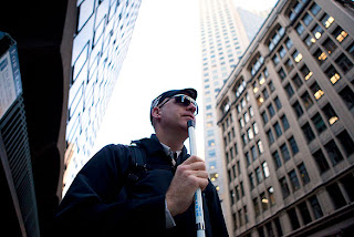
Chris Downey worked as an architect in San Francisco. While coaching one of his son's baseball games, he noticed he had trouble following the ball. After numerous visits to his doctor, he was told that he had a slow growing tumor on his optic nerve. After a grueling 9.5hr surgery, he had burred vision, and by the fifth day of recovery he had lost his sight altogether. 

He returned to work after his surgery but experienced major difficulties as he could no longer use the design software or read the plans. All of this took place during the worst dip in the economy, so like the rest of the businesses architecture firms took a financial hit. He was let go from the company.

Yet this didn't stop him from pursuing another job. He contacted other blind businessmen to see how they managed, eventually finding another blind architect in Portugal. He was the one who told Downey, "A blind architect is specially sensitive to tactile, acoustic and smelling details of the Architecture. . . The important thing is not stop working."

So he didn't. He found a blind computer scientist who discovered a way to print floor plans into brail. He has since been hired by another design firm and was a significant part in building a school for the blind. I think his unique take on design was said best by one of his coworkers:

“He can’t just look at a drawing at a glance. At first I thought, Okay, this is going to be a limitation. But then I realized that the way he reads his drawings is not dissimilar to the way we experience space. He’ll be walking through a plan with his index finger, discovering things, and damn, he’s walking through the building!”

This is a truly inspirational story that I had to share and would highly recommend reading or watching. 

Link to Chris Downey's website:

Links to articles:

Link to video:

After reading about Chris Downey I wanted to see if there were more things like his architecture. Here were some really cool examples of what I found. To read more about them please go to the links below (in the same order as photos).


Sunday, November 13, 2011

Hierarchy Observation


Hierarchy is one of the best ways to control how your viewer reads your message; it tells them the order in which you want them to see individual parts. This can generally be done using a variety of methods, such as: colour, size, placement, etc. The above are very simple examples of hierarchy, which is why I chose them. They really get the message across that hierarchy in design matters. It can even change the statement the designer is trying to get across (as it does in the last image). 

http://buildinternet.com/2010/04/designing-without-gradients/
http://www.core-marketing.co.uk/2010/02/typography-in-graphic-design/
http://liztroberts.tumblr.com/

Voice Project


My corner is located at the intersection of Arlington Street and Berkley Street, right by the Arlington T stop. I see it every morning and evening on my way, to and from school. The area is always buzzing with people. In fact that corner is usually the site of a pedestrian traffic jam when a lot of people are coming up from the T and crossing the street at the same time. There is a real mix of people in this area of Boston, as it is across the street from the Public Garden (a big tourist spot), has a bunch of retail shops, commercial businesses, and is right down the street from our school.

Therefore, I wanted a message that would address people from all walks of life, who I see hurrying around Boston. The message I chose was a quote my Mahatma Gahndi. It reads:
"There is more to life than increasing its speed."
I chose this message because it really spoke to me. Nowadays people go through life rushing; whether it's to get to a meeting on time, get through the week to the weekend, or even to their next milestone in life (engaged, married, have children, retire, whatever). They are pushing through life itself, and perhaps missing it along the way. This message to me is very soothing. To me, it says "hey you, cool it, take a breath".

I wanted a message that could have an impact no matter how close or far you were from it. When people were far away, all they can see is the word "life". They might be able to tell it has a little texture to it, which may encourage the person to cross the street and find out what it actually says. This essentially makes my audience DO what I'm trying to get across in the message. And vice versa. If someone's standing next to it, they may want to cross the street to find out what shape the repeated sentence is in.

The colour restrictions were a good thing for my design. I think if I was allowed colour, I would have come up with something that would essentially dilute the message. I had originally thought of using black, but reconsidered as the white markings would stand out more.

I knew what I wanted "life" to look like. It had to be lower case, and flowing from one letter into the next, so I chose to handwrite it. For the actual sentence, I thought at first it would be better to use a typeface, as I do not like my handwriting. But after much manipulation, the text looked overworked and awkward with all the angles and twists in the letters. In the end I wrote it out, which allowed for easy shifts in size, angle, and breadth of the words. Should I redo this project, I would like to make the thicks of the letters more extreme.

Tuesday, November 8, 2011

Pedro and Buddy- A tragic love affair

Buddy and Pedro are African penguins who live in the Toronto Zoo. They were brought up together in Ohio and have been recently transported to their new home. It was hoped that these two males would find suitable female partners to make little baby penguins to help this species off the Endangered Species List.

The African Penguin was moved from the Vulnerable Species List to the Endangered Species List in 2010 due to their significant decline over the past century. In 1910 there were believed to have been 1.5 million penguins of this species. As of the year 2000 it was estimated that only 10% of this population still existed. This decline has to do with a number of factors, mainly the increase in competition for resources (including our fishing industry) and the global climate change.

Anyway, back to the story... Upon Pedro and Buddy's arrival zookeepers noticed that these two male penguins seemed particularly chummy, showing "courtship and mating behaviors" generally witnessed between male-female pairs. This behavior includes preening each other, protecting their territory, 'braying' (their mating call), and standing together away from the group. Everyday they swim with the group of 12 penguins, but every night they break off from the others to spend the evening alone. This behavior was described as same-sex 'pair-bonding'.

Unfortunately, because the species is so endangered the zoo is planning on splitting them up in order to encourage them to breed. I'm really curious to find out whether they will show any interest in female penguins when they are separated. I tried researching this type of behavior in other species of animal, but to be perfectly honest, the information became a bit too graphic for my taste.

Here is a brief video of the two love birds (no pun intended):
http://www.youtube.com/watch?v=gyob3yHVOgs


Research from:
http://www.questconnect.org/african_penguin_facts.htm
http://www.birdlife.org/community/2010/09/african-penguin-receives-u-s-endangered-species-act-protection/
http://www.treehugger.com/endangered-species/zoo-plans-split-same-sex-penguin-romance.html

Voice Observation


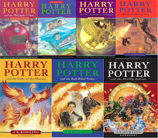
Check out this video of Harry Potter's biggest fan:
http://www.youtube.com/watch?v=I0VlIjXj9NA&noredirect=1


If you haven't heard of Harry Potter or Twilight, you must be living under a rock. Starting off very innocently with two authors, these two book series have taken on a life of their own. Hundreds of millions of copies of these books have been sold all over the world, which have since inspired Hollywood portrayals of the stories. I think it's fair to say that these stories have created fans so dedicated you'd think they were in a cult.

People designate parts of their home, fashion, or even body parts to pay tribute to these characters from the stories. Someone showed me the last photo of the woman covered in the characters of Twilight. Personally, I think it's insane. But both of these are great examples of voice, as they started with an idea from one person and have grown to affect millions of people. 

Sites I found along the way.
For all things Harry Potter:
http://www.mugglenet.com/

For all things Twilight:
http://thetwilightfansite.net/

Navigation Observation


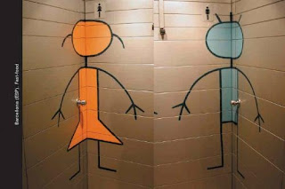
No matter where you are in the world, you have to know where to find the bathroom. With language changes, solely text signs would be challenging, which is why graphics are generally used. We've all seen the standard simple silhouette figures used to direct men and women to the correct door.

However, over the years I've noticed that there have been some very different restroom signs, depending on the theme of the restaurant. Here are some awesome unique bathroom signs, that are equally effective in showing you where to go, just a tad bit more imaginative.

Images were gathered from a number of sites:
http://blog.toiletpaperworld.com/funny-men-and-women-restroom-signs/
http://gina21guns.posterous.com/restroom-signs-around-the-world
http://techpp.com/2010/04/29/ultimate-list-of-funny-bathroom-signs/